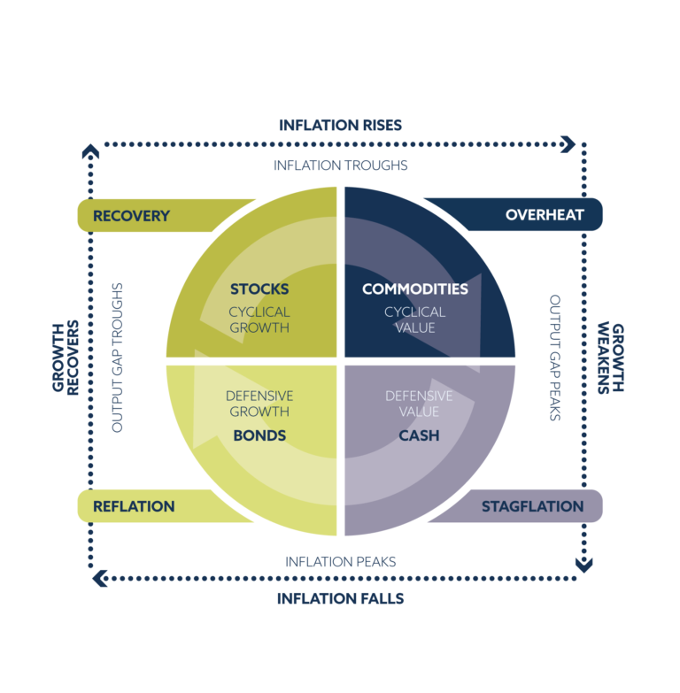
One cornerstone of our approach to investing is the market cycle. Understanding how cycles work over time allows us to adjust our exposure to maximise the probability that our investments work for our clients. Economies and markets are subject to cyclical patterns over time. These cycles aren’t quite clockwork but subject to a variety of economic factors and human psychology. There is a phrase that ‘history does not repeat itself, but it does rhyme’ and by paying attention to such rhythms we can learn from the past and apply these lessons to the present.
These cycles manifest themselves in the collective action of market participants.
One such example is the relative performance of US cyclical stocks (those most geared to the economy) versus US defensive stocks (those most insulated from the economic cycle) which have oscillated within a clearly defined range for the last 3 decades. Referencing the diagram above, investors tend to prefer cyclical stocks during expansionary periods and defensive stocks during recessions. This is consistent with the fact the peaks and troughs in the cyclicals:defensives ratio aligns perfectly with the highs and lows of the S&P 500 equity index over time as shown by the log-linear chart in the bottom panel.
The key takeaway from this chart, other than the clear cyclical nature of the relationship over time, are the points at which the marginal buyer, or seller, determines that the ratio has reached an extreme. These levels are driven by human psychology, which are represented visually on the chart by the yellow lines.
Similarly, our emerging market equity rotation model highlights a staggering cyclicality between the relative performance of Chinese, and emerging market equities excluding China, over time. This is represented by the blue and white lines below which are, in effect, mirror images of each other over time.
Commodities are nothing if not cyclical. They rise and fall with remarkable consistency over time. The mechanism through which this cycle operates is supply and demand. If supply falls, prices rise, bringing commodity producers on-line thereby increasing supply and reducing prices … and so on. Commodities do not exist in isolation, but this relationship is nicely represented in the chart below which shows the year-on-year percentage change in the S&P Goldman Sachs Commodity Index, which is a broad-basket of major commodity futures rolled into one composite index.
The cyclical low in each wave is demonstrated by the arcs at the bottom of the chart.
To help manage our commodity exposure over time, which can be a key source of differentiated return versus a traditional 60:40 portfolio, we use the gold/oil ratio. Since 1997, there have been four phases where this ratio has risen noticeably. These phases are identified by the circles which represent the dot-com bubble, sub-prime mortgage crisis, eurozone slowdown and Covid crisis.
The first circle in each phase represents peak-inflationary-optimism… the “pride before the fall”. The second circle in each phase represents peak-deflationary-pessimism… that “down and out” feeling you get at market bottoms. In each instance, when moving from the first circle to the second, gold has outperformed oil as fear rises and risk aversion sets in. Moving past the second circle represents renewed optimism as markets price in economic recovery.
The key takeaway from this chart is that the first circle in each cycle has consistently flagged a peak in commodity prices whereas the second circle has consistently flagged the bottom in commodity markets in each of the last four phases. We believe we are now moving from the first to the second circle in a new cycle.
Investing isn’t about predicting the future. It’s about recognising the position in the cycle and adjusting as required to stack the odds in your favour. This market cycle approach to top-down global macro investing helps inform our core investment outlook which we implement across our fund and model portfolio range in accordance with our investment process.
Titan Sustainable MPS
Below, each factsheet number corresponds to risk level, from 3-8
Titan Sustainable 3
Titan Sustainable 4
Titan Sustainable 5
Titan Sustainable 6
Titan Sustainable 7
Titan Sustainable 8
Subscribe to our newsletter
Our funds have moved
The previous Titan Asset Management funds have now moved to a new site and trading entity, Titan Investment Solutions. Titan Asset Management now holds the MPS only.
Below, each factsheet number corresponds to risk level, from 3-8
Titan Active MPS 3
Titan Active MPS 4
Titan Active MPS 5
Titan Active MPS 6
Titan Active MPS 7
Titan Active MPS 8
Titan ACUMEN MPS
Factsheet
Titan Passive MPS
Below, each factsheet number corresponds to risk level, from 3-8.
Titan Passive MPS 3
Titan Passive MPS 4
Titan Passive MPS 5
Titan Passive MPS 6
Titan Passive MPS 7
Titan Passive MPS 8
Paul Hunt
CEO
Paul Hunt is a proven business leader and entrepreneur with over 30 years’ experienceand track record of scaling businesses across multiple sectors. Hunt is highly experienced in business turnarounds, strategic planning and creating a positive people culture geared for success.
David Chandler
Senior Portfolio Analyst
David is responsible for providing operational support to the fund managers. David has passed the CFA UK IMC and graduated in 2018 with a degree in Economics and Business Management from the University of Sheffield.
James Peel, CFA
Portfolio Manager – ESG
James is a Portfolio Manager at Titan Asset Management and is responsible for Titan’s approach to sustainable investing. He previously worked as a researcher at the British Chamber of Commerce in Taipei. James graduated in 2018 from the University of St Andrews, where he studied economics. He is a CFA charter holder and has passed the CFA UK Investment Management Certificate (IMC), the CFA UK Certificate in ESG Investing and the CFA UK Certificate in Climate and Investing (CCI). He was also included in Citywire Wealth Manager’s 30 Under 30 in 2023.
Jonah Levy, CFA
Portfolio Manager – Physicals
When not collecting various minerals and mining memorabilia, Jonah can be found managing the physical allocations at Titan Asset Management. Prior to Titan he worked at Tavistock Wealth for 3 years, having previously gained experience in Holland at an oil brokerage, and in London at an energy trading house. Jonah is a CFA charter holder, having graduated from St. Andrews University with an MA in Management and Economics.
Alex Livingstone, CFA
Head of Trading – FX & ETFs
Alex is responsible for the ETF trading and FX strategy at Titan Asset Management and has executed over £5 billion of trades during his prior 4 years at Tavistock Wealth. Alex also assists in the wider portfolio management of the CIP specialising in technical analysis and risk management. He is a CFA charter holder and holds an BSc in Retailing, Marketing and Management from Loughborough University.
Sekar Indran, CFA
Senior Portfolio Manager – Equities
Sekar is responsible for managing the team’s equity investments. He helped expand the investment proposition over five years at Tavistock Wealth and continues this role at Titan Asset Management. Sekar has prior financial services experience at Barclays and Allianz. He is a CFA charter holder and holds a BSc degree in Industrial Economics from the University of Nottingham.
John Leiper, MSc, CFA, FDP, CFTe
Chief Investment Officer
John Leiper is the Chief Investment Officer of Titan Asset Management and carries direct responsibility for all investments in the Centralised Investment Proposition (CIP) at the firm. John has 15 years’ experience in financial markets having previously worked in a variety of roles at RBS, Morgan Stanley, Credit Suisse and Tavistock Wealth. John Leiper is a CFA and FDP charter holder and a member of the Society of Technical Analysts. He holds a BSc degree in Economics from Warwick University and an MSc degree in Economic History from the London School of Economics.
Damian Sharp
Chief Operating Officer
Damian’s financial services career spans over 30 years, the greater part spent at Pantheon Financial Management Ltd. As Managing Director Damian steered the group through its RDR rationalisation to its ultimate sale to Ascot Lloyd.
One cornerstone of our approach to investing is the market cycle. Understanding how cycles work over time allows us to adjust our exposure to maximise the probability that our investments work for our clients.